首先在static下新增一個css檔,寫下要的樣式:
1
2
3
4
5
6
7
8
9
10
11
12
13
14
15
16
17
18
| .td1 {
padding:100px;}
.container {
display: grid;
grid-template-row: 1fr 1fr 1fr;
grid-row-gap: 1em;}
.col1 {
grid-row-start: 1;
grid-row-end: 1;
font-size:20px;
text-align:center;}
.col2 {
grid-row-start: 2;
grid-row-end: 2;}
.col3 {
grid-row-start: 2;
grid-row-end: 3;
text-align: center;}
|
接著在result.html新增第三行及第六行(放在最上面就可)。因為要嘗試使用grid,就不用原本的table元素了:
1
2
3
4
5
6
7
8
9
10
11
12
13
14
| <!doctype><html>{% load staticfiles %}
<head>
<title>Harry Potter Quiz</title>
<link rel=\"stylesheet\" href=\"{% static 'result.css' %}\">
</head>
<div class=\"container\">
<div class=\"col1\">
<h3>測驗結果:{{ grade }}</h3>
</div>
<div class=\"col2\"><img src=\"{{ photo.url }}\" width=\"800\" ></div>
<div class=\"col3\"><a href=\"/quiz/\"><p>⇢再做一次測試</p></a</div>
</div>
</body>
</html>
|
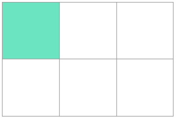
之前想把畫面置中一點,就土法鋼鍊,用CSS padding,試個老半天才找到滿意的位置,後來知道有Flex和Grid可以更方便地做佈局,今天就查了一點資料。
Grid的原理就是把畫面分成列跟欄,這樣可以很明確的知道放的地方。